 |
| [Top] World's Fair [Bottom] Europe |

Sunday, July 31, 2011
it's a small world (3 & 4) SUN-day
Last week, I introduced the "it's a small world" Sun concept with the iconic clock face and the first attraction region Sun, from the Arctic/North Pole. In the original 1964-65 World's Fair, the Arctic/North Pole Sun had a slightly different look. (I don't think this style currently exists anywhere any longer). Also this week is the Sun found in the European section of the attraction.
Saturday, July 30, 2011
Disneyland Sign 1960s (& early 70s)
 |
| Second in a Series of Five |
 |
| Disneyland Sign (1958-1971ish) |
Sometime in the early 70's (btwn 71 & 74), the white marquee with black letters got an upgrade. A new larger black sign with letters matching the existing yellow accents of the larger sign was installed.
This full Black & Yellow version of the sign, from the early 70s is my favorite version of the sign.
 | |
| Disneyland Sign (1972-1974) |
Around 1975, the yellow letter "D" (and I assume, all the letters,) got replaced with a new white version of its former self. The matching tag line portion, formerly reading "Park & Hotel - Entrance", was also replaced for the first time. Since the Park was heavily celebrating the Bicentennial, with a new parade and patriotic attractions, for two full years, the tag portion of the sign read "America On Parade".
 |
| Disneyland Sign, circa 1975-76 |
(Images are for historic illustration purposes only)
View the entire Disneyland Sign Series
by clicking the "Marquee" link on the right,
or by following the link [here]
Tuesday, July 26, 2011
Big News

Sunday, July 24, 2011
it's a small world (1 & 2) SUN-day
The first thing one sees when they walk toward the "it's a small world" attraction at Disneyland is the iconic clock face, ticking and tocking back and forth until each quarter hour when a parade of children pass to reveal the current time in giant numbers.
I know that anyone who rides this attraction notices children in unity singing the same song room after room (or is it continent after continent?) throughout the voyage. Recently guests have begun to notice the newly added classic characters (which I am not a big fan of, but can at least respect the artistic decision to make all the "real child" characters match the aesthetic of the original Small World children, while keeping "non-real child" characters, Woody, Dory, etc, looking more like play toys). What else do you notice while sailing the "seven seas"?
Now let me tie these two paragraphs together.
Since the very beginning of time, time itself was measured (or identified) the exact same way no matter where (or when) in this small world a child lived. It seems that "the Sun" is one of the more identifiable things that "we all share". And that element was not lost on this attraction design when it was first introduced in 1964 at the New York World's Fair. Today, the oldest existing "it's a small world" attraction, Disneyland's 1966 version, although somewhat altered from its original state, has the regionally appropriate versions of THE SUN in each and every show room of this beloved attraction.
Don't believe me? For the next several Sundays, I'll post duo images of the differing Suns found throughout the attraction. When all is posted and complete, take the time to see if you can spot all the different solar icons on the ride itself. (And lemme know if other versions around the planet are similar or different... I'd be love to add those variations)
For this week, however, I begin with the clock face itself and the first sun seen in the Disneyland classic! Sit back, keep you arms and legs inside the boat at all times, and enjoy the ride...
 |
| [Top] Clock [Bottom] Arctic/North Pole |
ADDITIONAL posts about
SMALL WORLD Sun Icons
will continue every Sunday
until August 21st!
Saturday, July 23, 2011
Disneyland Sign 1950s
 |
| First in a series of Five |
 | |
| Disneyland Sign circa 1955 |
Future posts will include different versions of the iconic sign, helping to document noticeable changes, big and small, including alterations and updates in the tag line. My reference has been taken from my own photos and from photos viewed on the web. I frequently used the schedule information posted on the marquee portion of the sign to identify dates wherever possible, but welcome any additional info to fill in gaps or to correct details.
(Images are for historic illustration purposes only)
View the entire Disneyland Sign Series
by clicking the "Marquee" link on the right,
or by following the link [here]
Friday, July 22, 2011
Disneyland Poster, July 17 1955
I have been saving my Disneyland ephemera since 1977. A ticket or guide book from each of my annual visits somehow avoided the trash after the day ended, and once I realized I had begun a small collection, I began to keep all of these free souvenirs to this day.
Had I had the insight, I would have collected a lot more than what I did. I would have even purchased some of the more cool items. But alas, I was poor and didn't foresee how fascinated I would be decades later with the historic significance of many of these items.
Thankfully, blogs and photo galleries on the web have created a venue in which to revisit the tickets, posters, maps, promotions, and photos of Disneyland through the decades.
I am still poor, so in lieu of actually purchasing these items, I have turned my interest into trying to create images that help to give historical significance... hence the different series of graphic images I am creating for this blog. With that in mind, I thought I'd share one of the first projects I did years ago, as a graphic design student.
I have always loved the Disneyland Attraction Posters; even long before they were reproduced and made available to guests, and even then, I couldn't afford them myself. So when my instructor announced a new assignment, to create a "period-appropriate" poster for an activity or event, it took two seconds for me to figure out what I'd be doing.
Below is my "early attempt" at a Disneyland silk screen style poster for the dedication event on July 17, 1955. My re-creation of the early castle logo had been completed long before this assignment, and truth be told it was a bit weak, with rough edges and crooked lines... perfect to represent screen printing!
This is simplistic, which is my style... and I can see many ways to improve upon this image, but I loved this poster when I made it, and still love it today. That is why I am rounding out this Disneyland Birthday week by including it here and sharing it with you.

Chronologically, this poster could never have been real. Walt's quote didn't happen until after the time stamped on the poster, the iconic Disneyland Sign did not exist for another three years, and the Park wasn't promoted as The Happiest Place on Earth at the very beginning. This is my romanticized interpretation, fifty years after the actual event.
Monday, July 18, 2011
Map Monday: Disneyland Historically
I have a background as a Disneyland Cast Member (and Anaheim native), map maker, and graphic artist...
That being said, I have been researching Disneyland history, records, and other details for the past decade or so. To date, I have created a visual record of Disneyland history, which I am very close to having complete. The Saturday series I have started, first with the ticket book history, and in the near future with a Small World tribute, and later with a Disneyland Marquee Sign history will soon have the ultimate history graphic series sharing the entire layout of the original park.
To generate a little bit of interest, at this time, I have compiled the most basic map images from those maps I have created from the years 1955, 1975, 1995, and potentially 2015... each 20 years apart from each other... just as a tease, for you, my reader.
I will be posting, in the near future, a map for each and every year of park operation, not just these 20 year leaps. How the park evolved, and how the original elements are still identifiable and how important original items are still visible will be represented. I am still trying to figure out how to best represent the details I want to share, so bear with me... and please feel free to ask questions and offer suggestions...!!!
So the finished series will have a lot more detail, let me know what details you wanna see by posting a reply on this blog below and I'll see how I might incorporate your interest/request. And look for this series to begin its 50+ week run beginning in about late August/early September right here on this blog!
That being said, I have been researching Disneyland history, records, and other details for the past decade or so. To date, I have created a visual record of Disneyland history, which I am very close to having complete. The Saturday series I have started, first with the ticket book history, and in the near future with a Small World tribute, and later with a Disneyland Marquee Sign history will soon have the ultimate history graphic series sharing the entire layout of the original park.
To generate a little bit of interest, at this time, I have compiled the most basic map images from those maps I have created from the years 1955, 1975, 1995, and potentially 2015... each 20 years apart from each other... just as a tease, for you, my reader.
I will be posting, in the near future, a map for each and every year of park operation, not just these 20 year leaps. How the park evolved, and how the original elements are still identifiable and how important original items are still visible will be represented. I am still trying to figure out how to best represent the details I want to share, so bear with me... and please feel free to ask questions and offer suggestions...!!!
 |
| Click on image to view full size |
So the finished series will have a lot more detail, let me know what details you wanna see by posting a reply on this blog below and I'll see how I might incorporate your interest/request. And look for this series to begin its 50+ week run beginning in about late August/early September right here on this blog!
Sunday, July 17, 2011
Happy Birthday Disneyland
Herb Ryman created some fantastic art for Disney. Among them are images that represent New Orleans Square, Epcot, and Tokyo Disneyland, each painted before the individual subjects were actually created. Of his work, my favorite is the first concept drawing of Sleeping Beauty Castle.
My first quarter in art school, we were tasked to re-create a master art piece. I chose to try my hand at Ryman's Castle. As much as I enjoy creating digital art, this was a freehand drawing class, so I this subject because it is near and dear to my heart. I never claimed to be a stellar artist, and freehand is not my forte, but I was very pleased with my results. (And I got an "A" on it, too!)
The following week in class, the assignment was to re-draw this piece. The catch was that is needed to be done in black and white, only using grey scales to represent color and shadow.
A couple years later, I took the opportunity to revisit these favorite drawings of mine. Since the original drawing was created to represent something that was in the process of design and building, I reworked my version to also represent the creative design process in action.
On this day, 56 years ago, the actual Sleeping Beauty Castle made its debut. The real thing varied somewhat from this first sketch. The story is told of the model for the castle in which Walt Disney preferred the upper floors turned backwards. Today, this view of the upper floors can be seen from inside the castle walls in Fantasyland.
My first quarter in art school, we were tasked to re-create a master art piece. I chose to try my hand at Ryman's Castle. As much as I enjoy creating digital art, this was a freehand drawing class, so I this subject because it is near and dear to my heart. I never claimed to be a stellar artist, and freehand is not my forte, but I was very pleased with my results. (And I got an "A" on it, too!)
CLICK ON ANY OF THE IMAGES BELOW
TO SEE LARGER VERSIONS
 |
| Ryman Castle Reproduction |
The following week in class, the assignment was to re-draw this piece. The catch was that is needed to be done in black and white, only using grey scales to represent color and shadow.
 |
| Ryman Castle B/W Reproduction |
A couple years later, I took the opportunity to revisit these favorite drawings of mine. Since the original drawing was created to represent something that was in the process of design and building, I reworked my version to also represent the creative design process in action.
| Ryman Castle Creation Reproduction |
On this day, 56 years ago, the actual Sleeping Beauty Castle made its debut. The real thing varied somewhat from this first sketch. The story is told of the model for the castle in which Walt Disney preferred the upper floors turned backwards. Today, this view of the upper floors can be seen from inside the castle walls in Fantasyland.
H A P P Y B I R T H D A Y
D I S N E Y L A N D ! !
Saturday, July 16, 2011
Disneyland Ticket Books 68-82
The return to Globe Paper background for the first time for the E to A Ticket Style.
Return to Globe Paper.
Ticket Price increase... C to E raised to .40 .70 .85
It may be minor, but in 1974, the red A B C D E lettering became bolder.
Prices probably changed again in 1975, as all tickets printed after this date dropped the cash value altogether. This was also when the "Disneyland" logo was modernized to the logo we know today.
 |
| Ticket Book 1968 Reproduction |
 |
| Ticket Book 1970 Reproduction |
 |
| Ticket Book 1974 Reproduction |
 |
| Ticket Book 1975 Reproduction |
View the entire Disneyland Ticket Book Series
by clicking the "Ticket Books" link on the right,
or by following the link [here]
Saturday, July 9, 2011
Disneyland Ticket Books 66-67
For just 2 years, the traditional Globe ticket paper was replaced with a new Castle background. This was likely an attempt to make the tickets differ from previous ticket books, because it was at this time that the A to E tickets became E to A tickets, for the first time making the A Tickets full sized and the E Tickets now became the smallest sized tickets. The E ticket, the most popular, was likely moved to the front of the ticket book for easy accessibility. This made the new E tickets the same size as the previous A tickets.
Smaller E Tickets and larger A Tickets on a new Castle background.
In 1967, the D and E Tickets were raised in price to .60 and .75, respectively
 | |
| Ticket Book 1966 Reproduction |
 |
| Ticket Book 1967 Reproduction |
View the entire Disneyland Ticket Book Series
by clicking the "Ticket Books" link on the right,
or by following the link [here]
Friday, July 8, 2011
About "About Me"
My profile icon explains a lot about me, but it is displayed so tiny, I'll present a larger image here for you.
 |
| Everything there is to know about me. |
Monday, July 4, 2011
Happy Fourth of July
During 1976, America was celebrating its Bicentennial year. Everything was marketed with 1776, 1976, 200 years, America, and Independence. Disneyland spent over a year with the same idea, and since I lived less than 5 miles away, I got caught up in the marketing campaign. I can still picture some of the items I owned that incorporated the iconic Disney image referenced below, as they were some of my favorites. Mickey, Goofy, and Donald lead the America on Parade, Mr Lincoln was updated on Main Street, and America Sings was introduced at the Carousel Theatre.
Personally, I think this is one of the first examples of a really great promotional concept at Disneyland, and it remains one of my favorites. Here is my interpretation of that 35+ year old image.
 Only 15 more years until the 250th Anniversary... I wonder if Disney has started working on a new iconic logo yet.
Personally, I think this is one of the first examples of a really great promotional concept at Disneyland, and it remains one of my favorites. Here is my interpretation of that 35+ year old image.

Saturday, July 2, 2011
Disneyland Ticket Books 59-65
On June 14 1959, Disneyland experienced its first significant expansion. New attractions included the Submarine Voyage, the Monorail, and the Matterhorn Bobsled. With these great new attractions, a new "E-Ticket" was introduced too.
This set of tickets also changed the lettering style of the ticket values from previous black & bold font style to a newer and contrasting red & narrow font style.
In 1960, the words "Exchange For" were replaced with the words "Good For"
Beginning in 1961, the Special Ticket Book Price was included.
1965 saw the C thru E ticket prices going up to .35 .45 & .60
(formerly .30 .35 & .50)
Technically, this was the first price increase at Disneyland. Even during the 50's, when the D Ticket was the highest value ticket, that value was still only .50--- upon the introduction of the E ticket in 1959, the D ticket was reduced to .35 cents, allocating the max .50 value to the new E tickets until the 1965 price increase.
 |
| Ticket Book 1959 Reproduction |
 | |
| Ticket Book 1960 Reproduction |
 |
| Ticket Book 1961 Reproduction |
 |
| Ticket Book 1965 Reproduction |
(formerly .30 .35 & .50)
Technically, this was the first price increase at Disneyland. Even during the 50's, when the D Ticket was the highest value ticket, that value was still only .50--- upon the introduction of the E ticket in 1959, the D ticket was reduced to .35 cents, allocating the max .50 value to the new E tickets until the 1965 price increase.
View the entire Disneyland Ticket Book Series
by clicking the "Ticket Books" link on the right,
or by following the link [here]
Friday, July 1, 2011
Today is Cat Day
My website, SimbaSpot, is named after my siamese cat, Simba, who came to me as a kitten in 1994, the same year The Lion King premiered. Yes, he was named after the lion cub.

The reason today is Cat Day is because six years ago, today, we adopted a senior cat, Kira, who despite her age, reminded me so much of The Aristocats' Marie.
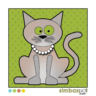 They have both passed on, but I keep them near me by creating the cat art seen above. (Their two brothers, Bailey and Sidney now rule the roost... Bailey even blogs about cats on the BaileyBlog!!)
Sometimes the line between cats and Disney gets even blurrier! Below are some of my favorite cats, dressed up in costumes you might recognize.


The reason today is Cat Day is because six years ago, today, we adopted a senior cat, Kira, who despite her age, reminded me so much of The Aristocats' Marie.

* * * * *
Sometimes the line between cats and Disney gets even blurrier! Below are some of my favorite cats, dressed up in costumes you might recognize.


Subscribe to:
Posts (Atom)